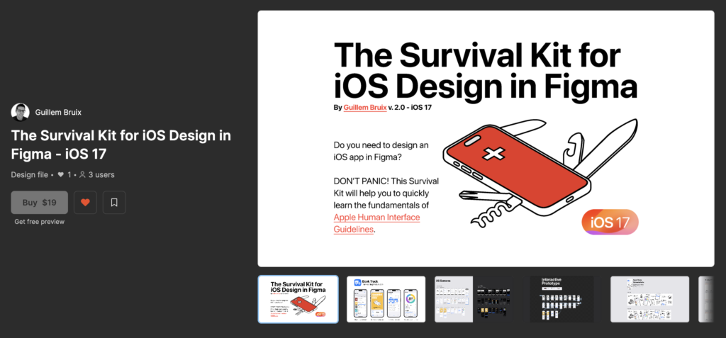
Do you need to design an iOS app in Figma? DON’T PANIC! This article will help you to quickly learn the fundamentals of Apple Human Interface Guidelines (HIG). This understanding will enable you to design UIs that are not only beautiful on the iPhone but also usable, accessible and code-friendly, saving you and your developer a lot of time. Learn how to survive the design process of well-structured and responsive UIs with Figma’s Auto-Layouts and how to not be afraid of the Dark Mode using Variables.
Hey! My name is Guillem Bruix, I’m a product designer who codes my own apps. My technical understanding of how to program native iOS apps with SwiftUI in Xcode helped me to design better iOS apps in Figma that can be easily implemented in code while remaining HIG compliant. I decided to share this knowledge with The Survival Kit for iOS Design in Figma (for iOS 15) in the Figma Community two years ago. I’m so happy that the Survival Kit has been used by more than 32K designers so far, so I’ve decided that it is time to release a new and improved version for iOS 17 using Figma variables with a real app example. I’ll try to explain the most important topics for designing good iOS apps in Figma in the following lines.
Getting Ready
- Preferably, use Figma desktop app instead of Figma in your browser. If you use Figma in your browser, you can’t use your local fonts. You will need to use Apple’s fonts to use iOS default typography and icons. If you prefer to use your browser, then you will need to install the Font installers to use Apple’s SF Fonts and SF Symbols icons.
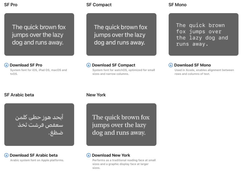
2. Download and install all Apple’s fonts: Apple has designed the following typographies that perfectly work on all their devices. If you don’t have a strong brand reason to use other fonts, use always Apple’s SF or NY fonts on your app designs.
3. Download and install Apple’s SF Symbols icons: You can use all Apple’s SF Symbols icons for free. Just copy the icon’s name in SF Symbol’s Mac app and paste it in a Figma text fields with SF Font. iOS developers can easily use the same icons in Xcode.
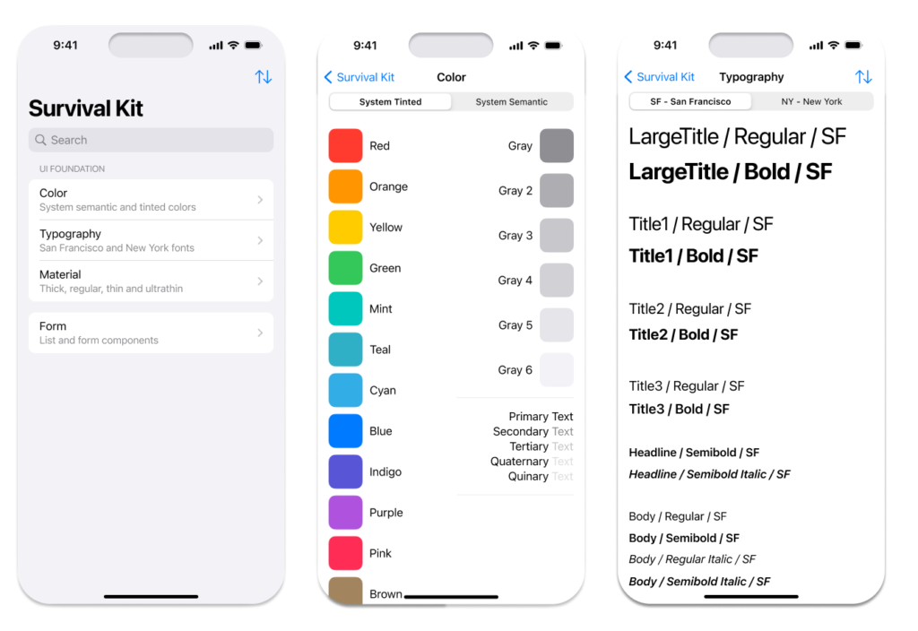
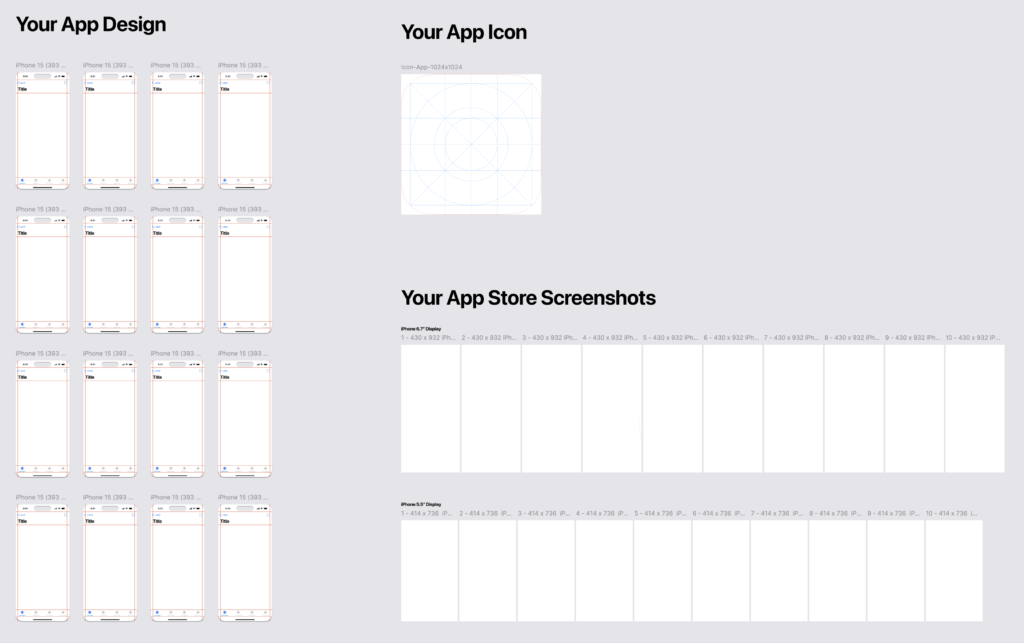
4. Download The Survival Kit for iOS Design in Figma (Optional): Speed up the process of designing apps using my Figma kit. You will find blank templates for the correct screen size, all the necessary styles and variables to use the correct typographies, colors, and components already set up for four different modes: Light, Dark, Accessibility Light, and Accessibility Dark. Additionally, there are many examples of screens, icons, prototypes, and App Store screenshots designs ready for you to use.
Note: At the end of this article, I’ll explain how to download the Survival Kit for FREE for a limited period of time.
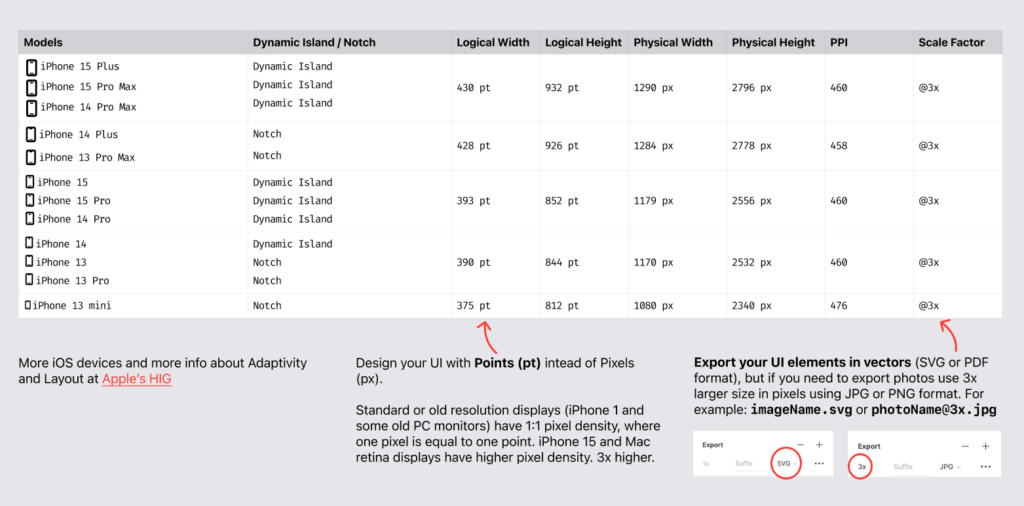
iPhone 15 Frames
Create a frame of 393 x 852pt in Figma to start designing your app. Take in consideration the 16pt margins and the restricted areas for the Status Bar, Navigation Bar, Tab Bar and the Home indicator.
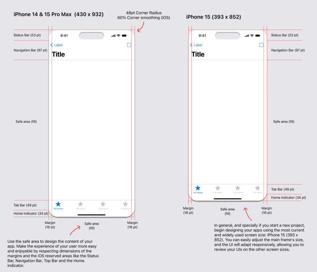
Note: You don’t need to recreate the iPhone frames if you have the Survival kit just go to the blank template in Layer 6 to start design your own app:
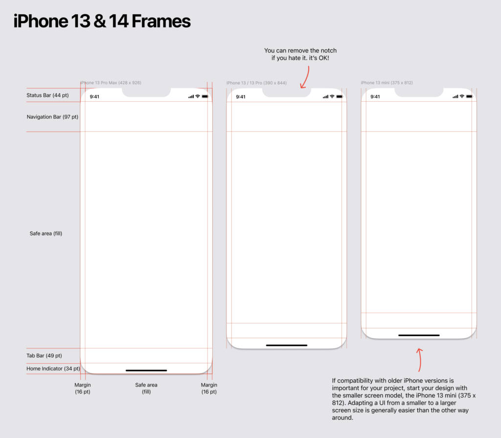
Generally, always start your design with the iPhone 15 frame (or the most recent available iPhone), but If compatibility with older iPhone versions is important for your project, start with the smaller screen model, the iPhone 13 mini (375 x 812pt). Adapting a UI from a smaller to a larger screen size is typically easier than the other way around.
Screen Resolutions & Exports
Color
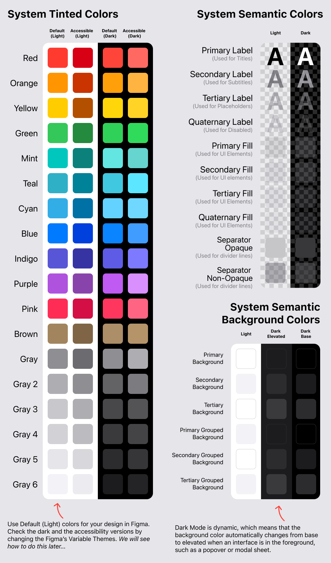
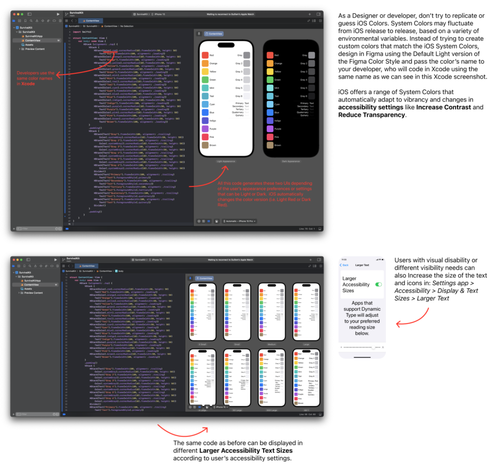
Apple’s System Colors are the colors used by Apple in all Apple’s iOS apps. The system colors look great individually and in combination, on both light and dark appearances. Light and dark versions are not exactly the same color. Dark versions are a bit lighter in order to look similar to the light version in dark environments.
When you use System Colors for designing your app color palette, the developer can use the same color names in Xcode and the app will automatically get support for both appearance modes. Also, for accessible versions accordingly to the user’s settings.
Can I use other colors?
Of course you can! If you already have a brand that use a unique palette you can use the colors of your brand, but then you will need to provide all versions (light, dark and accessible versions). If you design your color palette from scratch, it’s a good practice to choose from Apple’s System Colors.
What about Black and White?
Apple provides black and white as System Tint Colors. However, the recommendation is to use the Semantic Primary Label or Primary Background whenever these colors are needed. This approach ensures the correct use of Light and Dark Appearances. The same applies to gray colors; whenever possible, use the Secondary, Tertiary, and Quaternary versions. A System Semantic Color conveys its purpose rather than its appearance or color values. For example, iOS defines colors for use in background areas and for foreground content, such as labels, separators, and fill. These colors have different transparency levels.
System Gray Colors
iOS provides a range of six opaque gray colors you can use in rare cases where translucency doesn’t work well. For example, intersecting or overlapping elements (such as lines or bars in a grid) look better with opacity. In general, use the semantically defined system colors (the ones on the right column) for UI elements like text labels or background colors.
iOS Colors in Figma
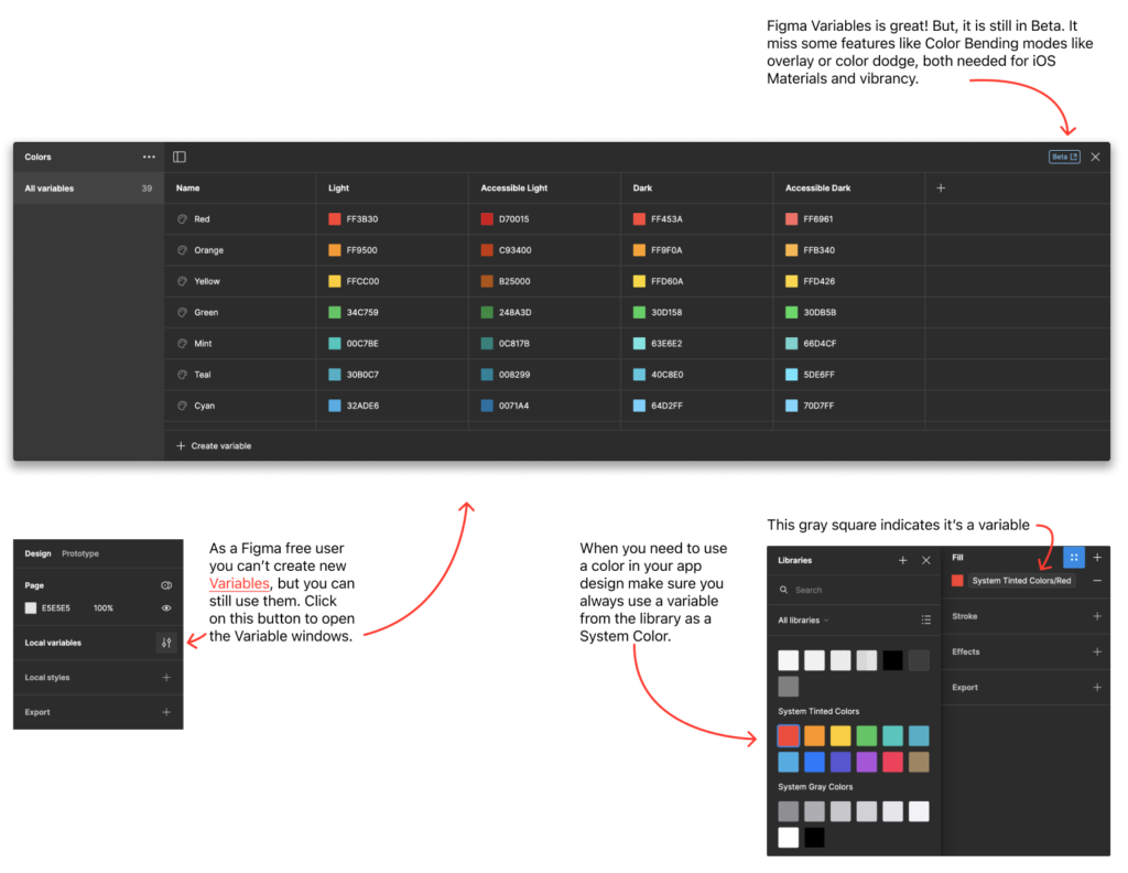
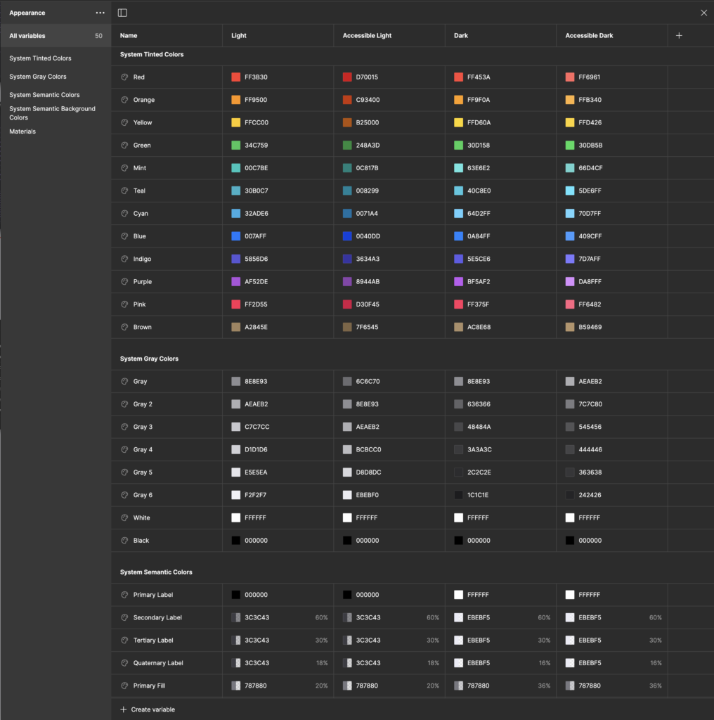
As a good practice, it is better to create Figma’s local variable instead of Figma’s color styles for the different color modes (Light, Dark, Accessible Light and Accessible Dark). In this way, changing the appearance of your designs is superfast!
What are the values of these colors?
You can find all the color values in Apple’s System Colors, then you will need some time to copy one by one into your Figma’s local variables or use The Survival Kit where I already did it for you:
Typography
The following typefaces are designed by Apple to optimally display text at a variety of sizes and in a wide range of languages across multiple iOS UIs.
San Francisco (SF) is a sans serif type family designed by Apple that includes SF Pro, SF Pro Rounded, SF Mono, SF Compact, and SF Compact Rounded. SF Pro is the system font in iOS.
New York (NY) is a serif typeface also designed by Apple that provides a unique tone designed to complement the SF fonts. NY works as well in a graphic display context (at large sizes) as it does in a reading context (at text sizes).
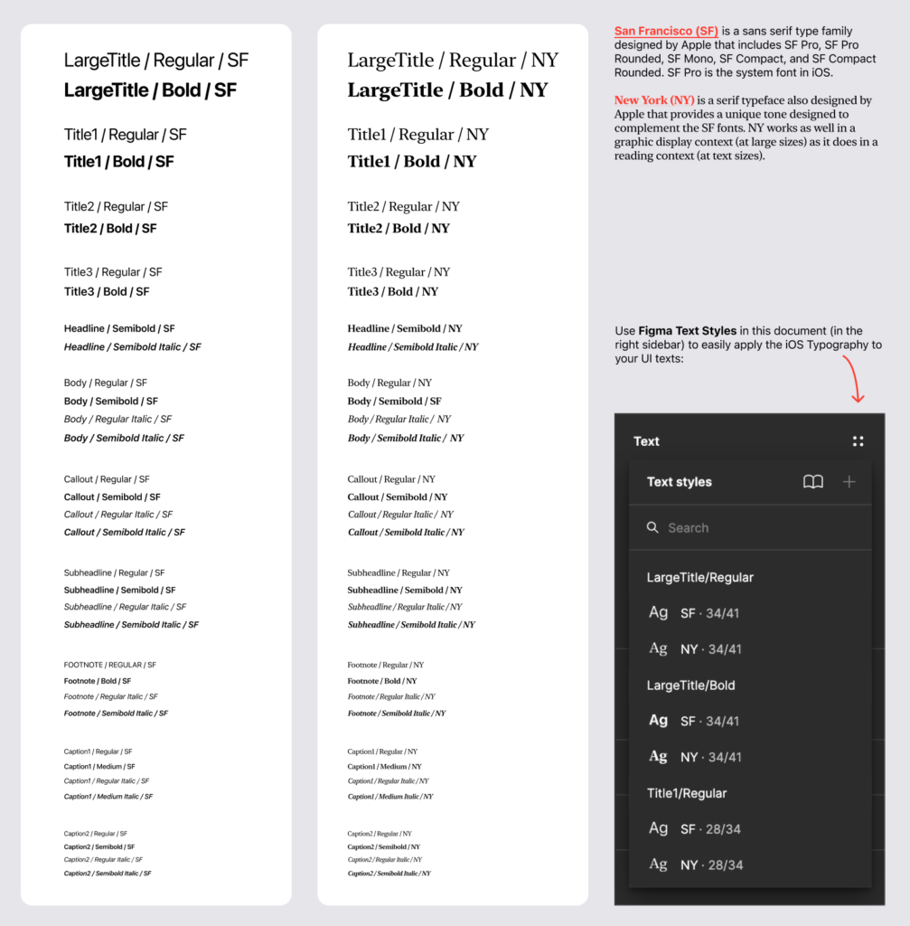
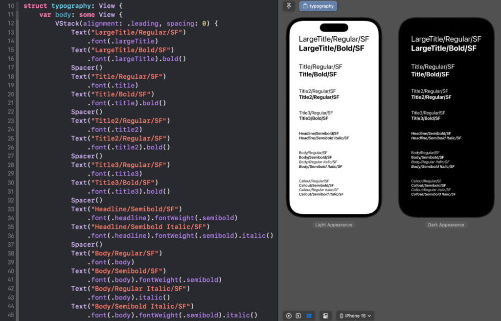
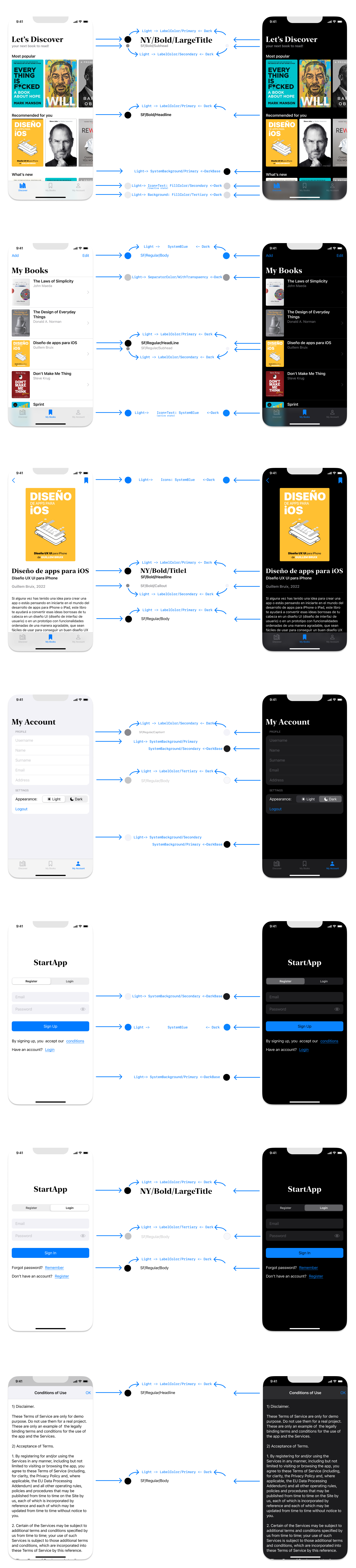
The names and attributes of the above Text Styles in Figma are the same ones that Apple uses on its apps and recommend developers to use. The same style names can be used in code inside Xcode, so if you use these styles in your designs in Figma, your developer can easily implement them in Xcode:
Dynamic Types
By using the same Text Style in Figma and in Xcode you will automatically implement without extra effort, maybe without knowing it, the Dynamic Types. When we use semantic names (Title, Headline, body…) instead of fonts with attributes. iOS can adapt the size of these styles, keeping the same ratio.
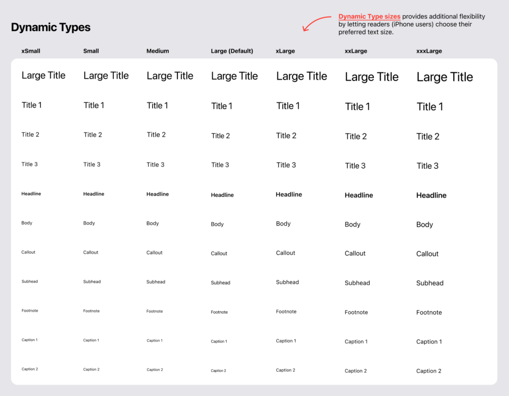
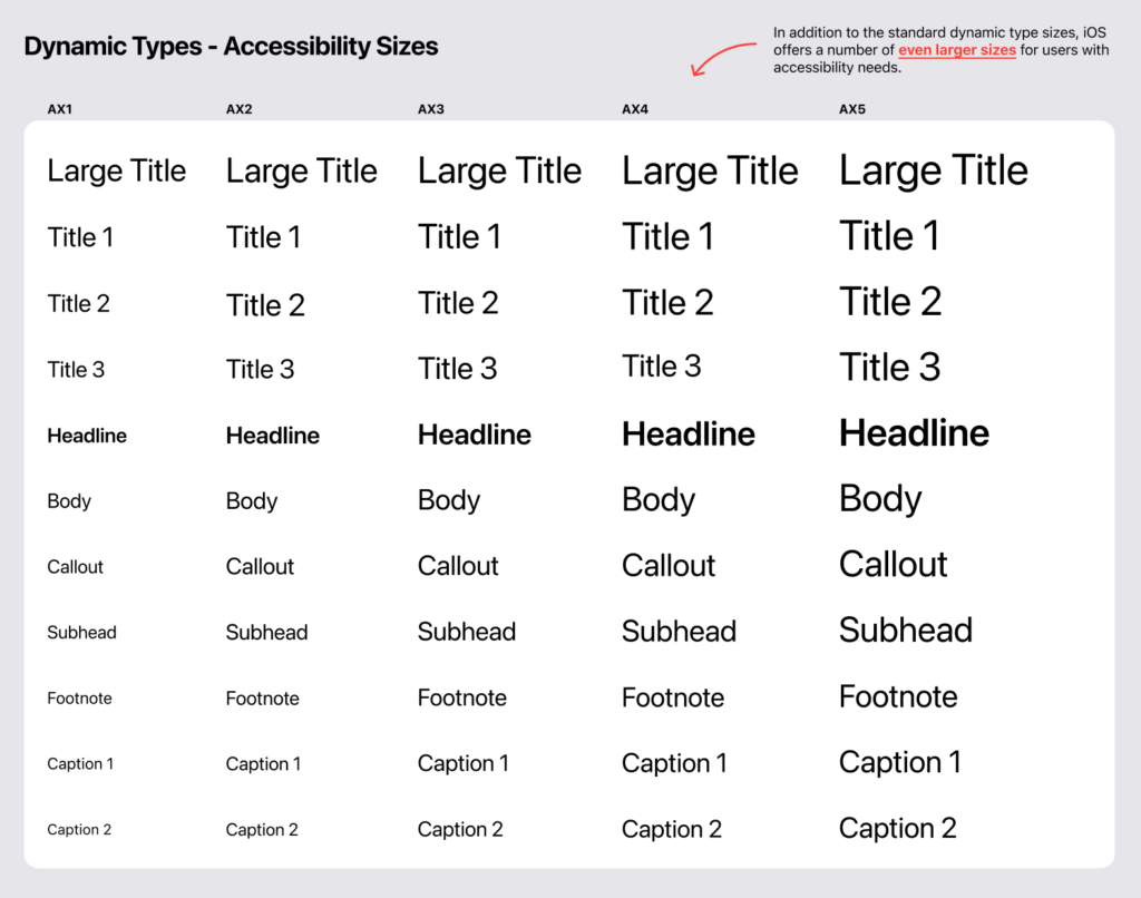
Also, we’ll provide support for accessibility:
How and where to use iOS Text Styles and Colors?
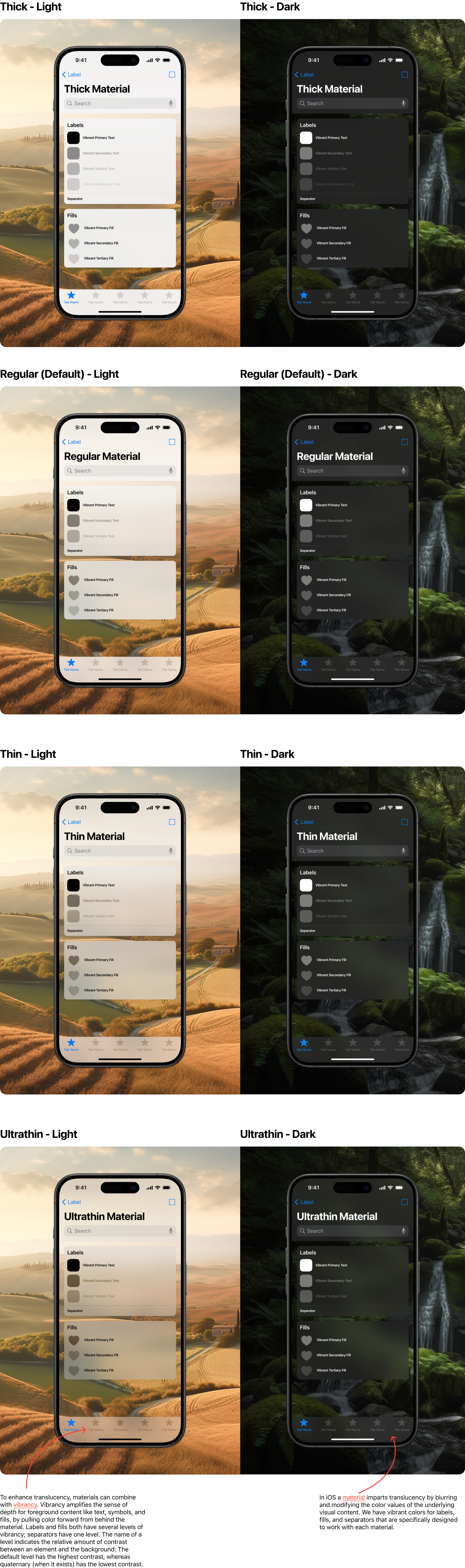
Material
Some components in iOS can use different background materials. These materials employ diverse levels of vibrancy and translucency to blend background colors with foreground content, creating a sense of context and focus through different blur levels. Vibrancy helps make content stand out while still maintaining a connection to the background.
Accessibility & User’s preferences
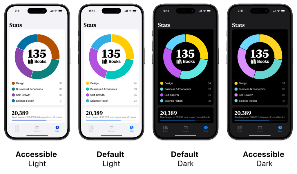
If you were wondering why there are four versions of the red color or so many dynamic types, the answer is that there are users who prefer to use apps in Dark Mode. Additionally, some users, such as your grandma, may have difficulty reading small text, while others might have some level of color blindness or a combination of these challenges. For these reasons, as designers or developers, we need to provide different modes or appearances for these groups of users. The good news is that by using Apple’s System Colors and Dynamic Typefaces, you don’t have to worry about this, as iOS handles it automatically for us. However, it is always good practice as a designer to check how your designs work in the four available modes in Figma.
Accessibility & user’s preferences for iPhone users:
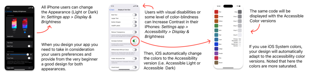
Accessibility & user’s preferences for Xcode developers:
Accessibility & user’s preferences for Figma designers:
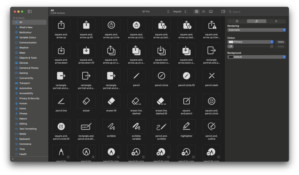
SF Symbols
Apple provides all these icons for free to use in our iOS apps. You just need to download and install SF Symbols app on your Mac to easily find the icon you need, check the names and the multicolor options. Once you have Apple’s fonts install in your Mac you can also use SF Symbols in Figma desktop app. Learn more about SF Symbols here.
iOS Components
It’s a good practice to use the standard iOS components in your UI Designs and the good thing is that you don’t need to copy or re-vectorize all iOS components in Figma. Apple already did this for us, and kindly has shared it with the community.
You can duplicate the Figma file in this link and use it for your Figma projects. However, Apple doesn’t support Figma variables, but you can use my adaptation in the Survival Kit to change the components between the 4 Color Modes: Accessible Light, Default Light, Default Dark, Accessible Dark.
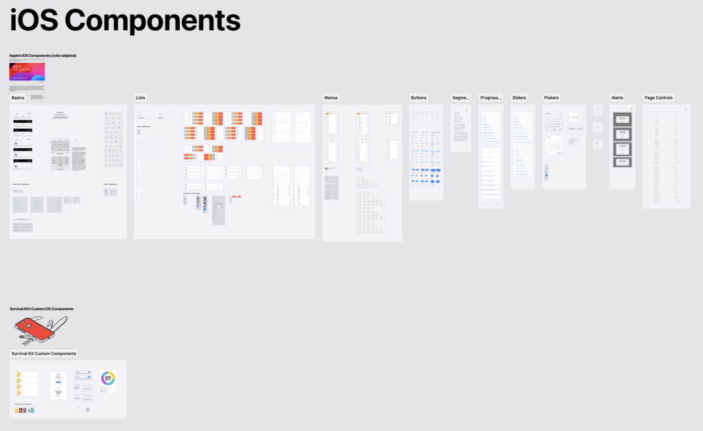
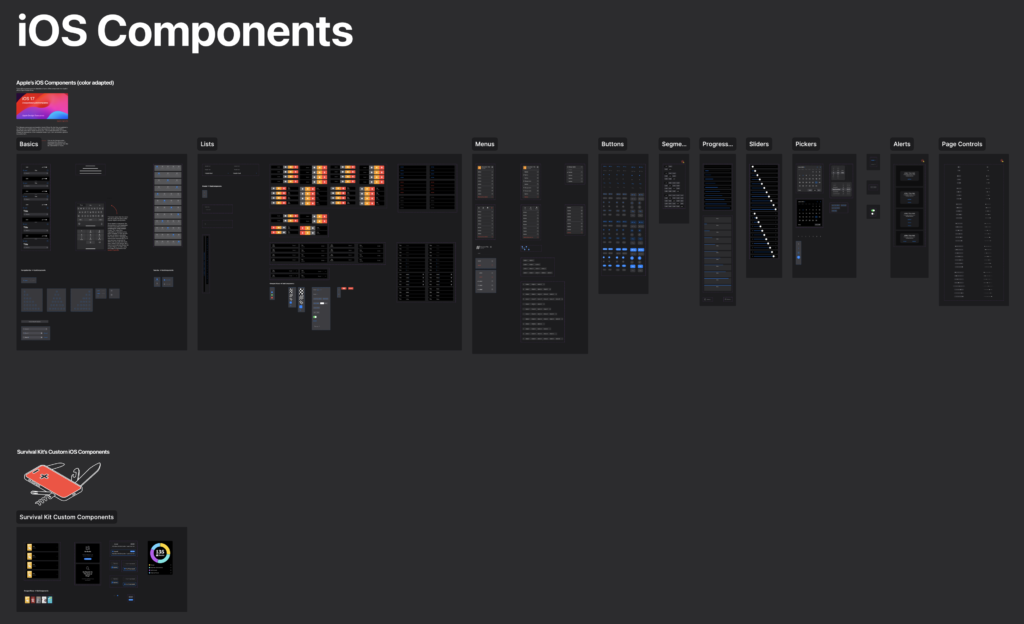
Don’t re-invent the wheel!
At least if you don’t have a good reason to do so. You will need to use some iOS standard components like forms, text fields, buttons, navigation systems, etc.. Apple Design team is being designing a consistent Design System for iOS during years, and they did a great job! All iPhone users are already familiar with iOS tab bars, alert messages, date pickers, etc..
Make your developer happy. Take in consideration that to code standard components is much easier and faster for developers than to code new components from scratch.
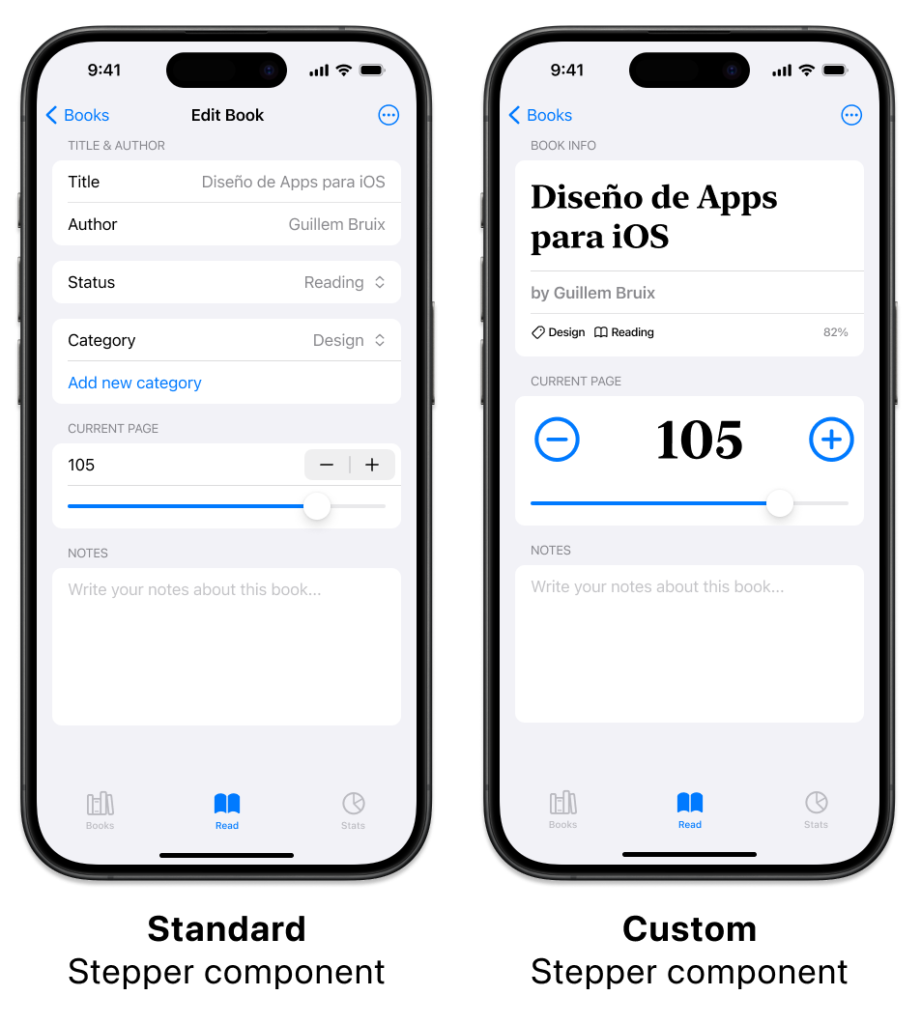
When to design your own components?
If we are using all Apple’s typographies, colors, icons and components, eventually, our apps will look like another Apple’s app. They will have a great usability, yes, but also they will look a bit boring and lacking a personality. From time to time, it is a good idea to personalize some components, especially, the most visible ones like the tab bar or some other buttons like this custom stepper component:
App Design
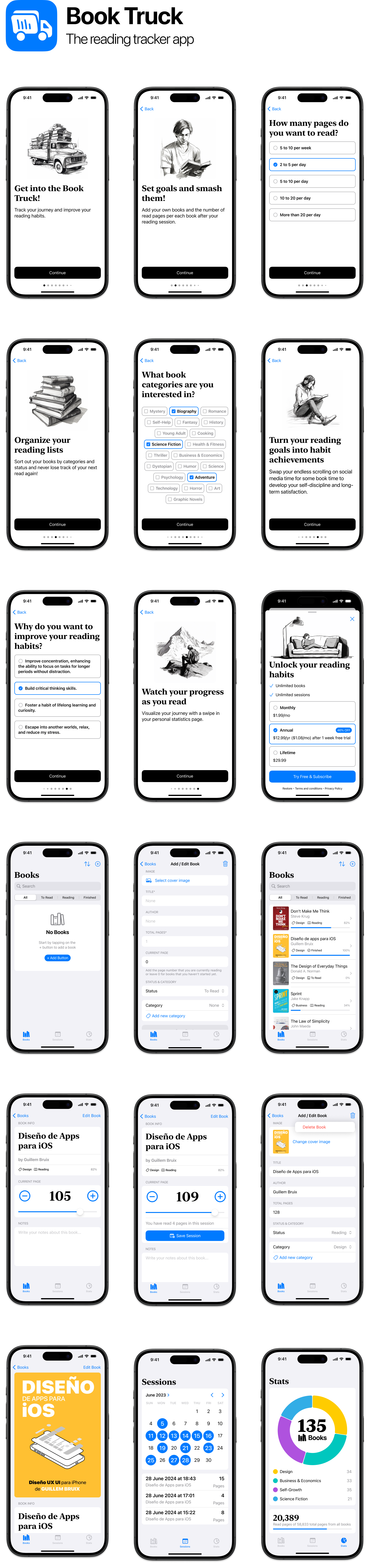
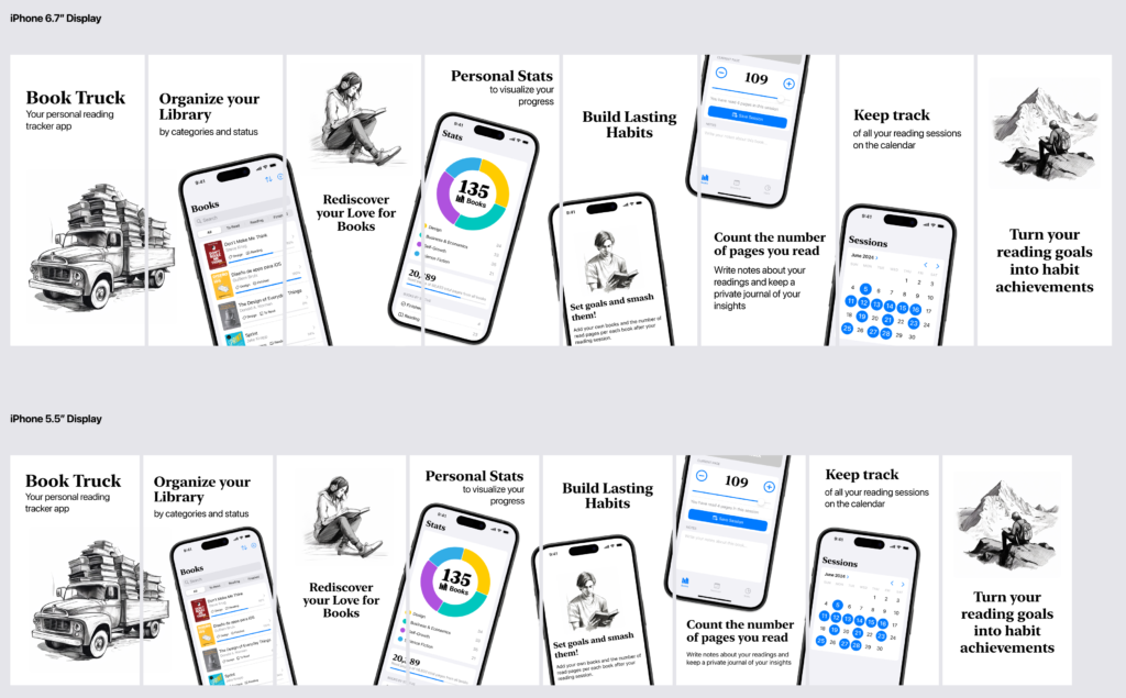
In iOS design, you can use different types of navigation systems to display the screens or sections of your app. By using a standard iOS navigation system, you ensure that the user is already familiar with how to navigate your app. The Survival Kit sample app uses a Navigation Stack system, similar to the iPhone Settings app, to move between sections. In contrast, the Book Truck app (see below) uses a combination of an onboarding flow and a Tab Bar. Feel free to use these two apps as references to copy components or as inspiration for designing your own app.
The Book Truck app is a real app that I have coded and published in the App Store. This means that the app has successfully passed all of Apple’s controls regarding UX / UI design, and it is possible to easily code using standard SwiftUI components.
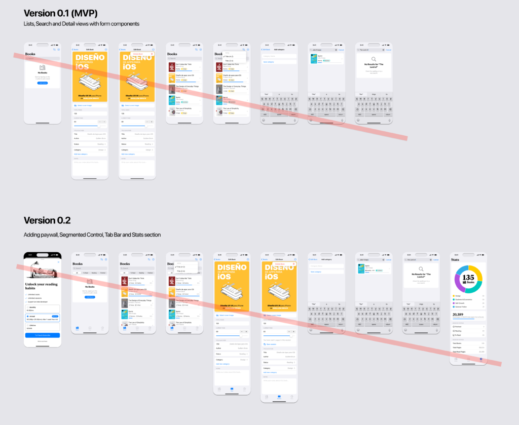
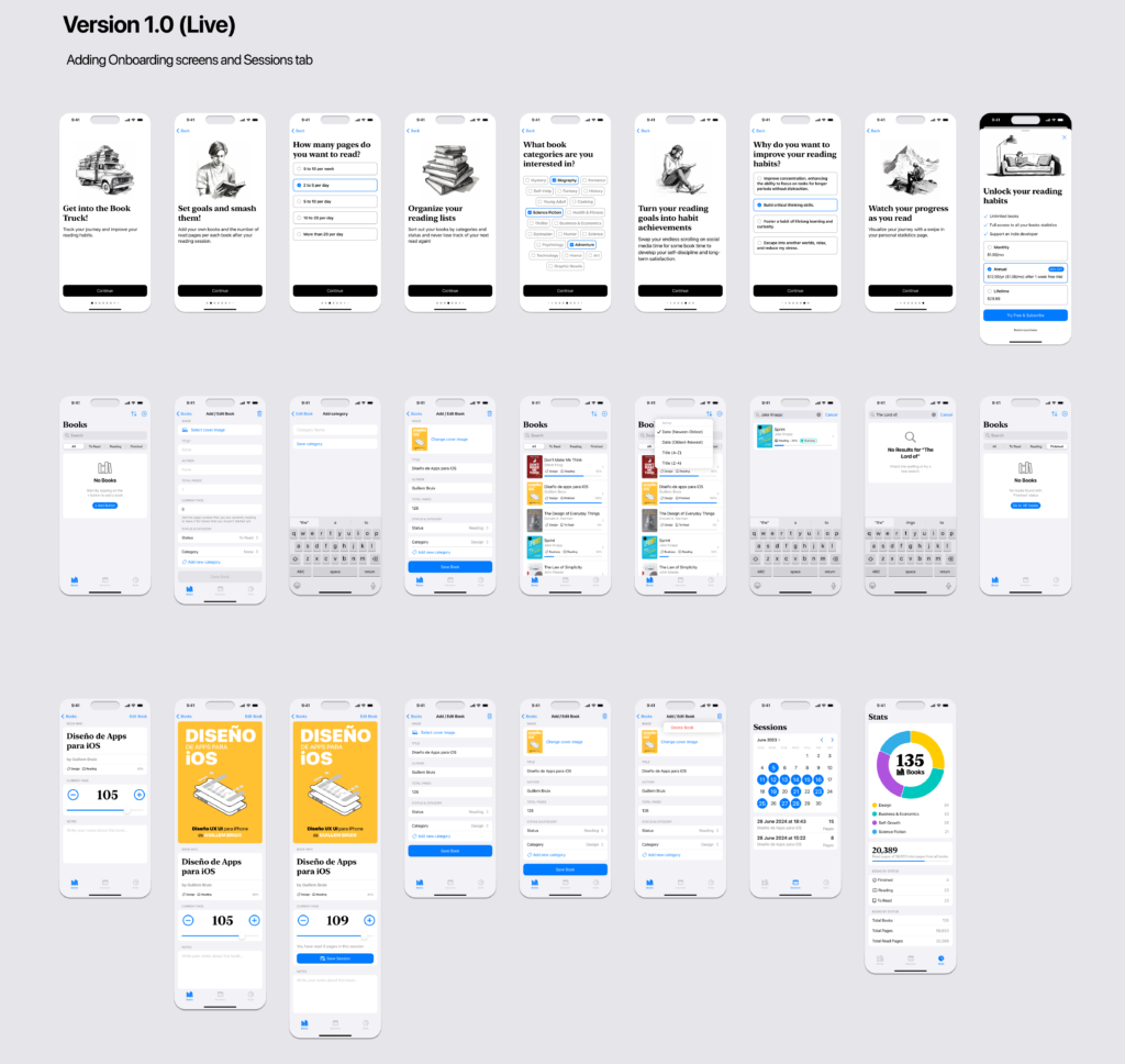
In the app design process, you start by assembling the elements: text styles, colors, components, and more. Sometimes, it is difficult to know where to begin. My recommendation is to have a list of the main features you want your app to include — features that you believe will solve the primary problems of your users. You can use the Double Diamond design framework for these UX exercises. I have another article where I explain more about the Double Diamond.
Start with the most important features to design a Minimum Viable Product (MVP) or version 0.1. Then, add more features and make design refinements for version 0.2, followed by a final release candidate version or version 1.0. Use this version to create a prototype in Figma to test with users before you or your development team start coding. This is my process as an indie developer, but of course, each person or product team should decide what works best for them according to their time, resources, and expectations.
Interactive Figma Prototype
Figma has pretty cool tools for prototyping. You can make high fidelity protypes by clicking the “Prototype” button in the right top sidebar and the “ ▶”️ button to go to the prototype or presentation view. You can even try your prototype app in your iPhone. You only need to Download Figma’s Mirror app in your physical device (your iPhone). The experience is very close to a finished programmed app. This is so useful if you want to do user tests before program a single line of code or preview your designs i a real device.
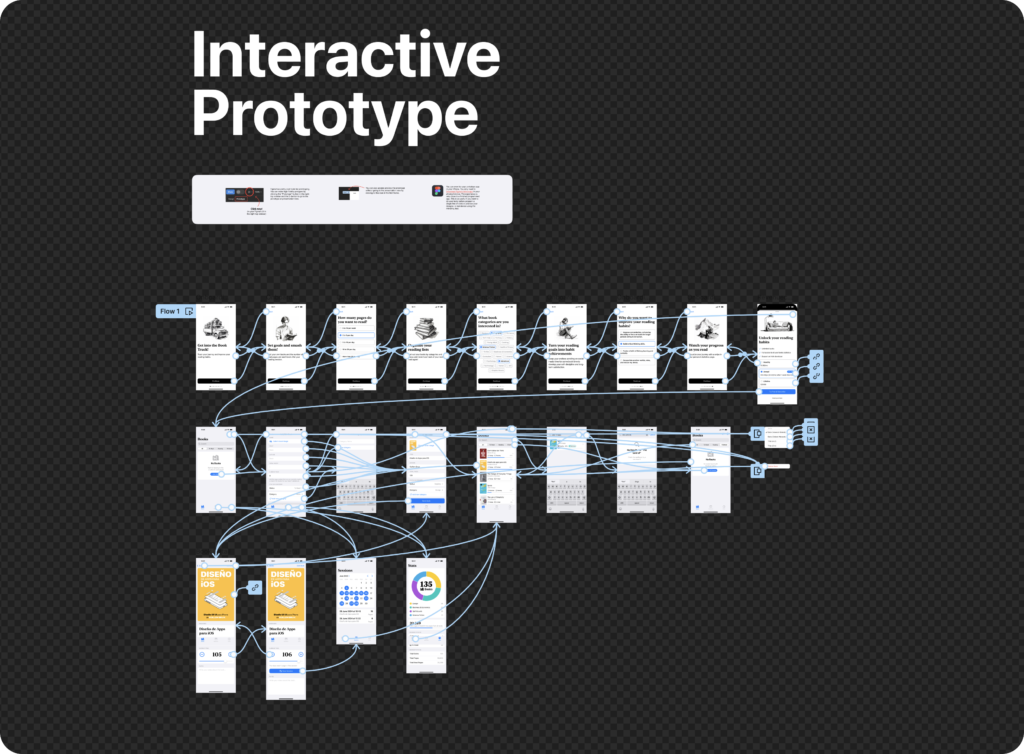
Try the Book Truck Figma interactive prototype: https://www.figma.com/proto/rHtH7fqGakNKKID5joraRA/The-Survival-Kit-for-iOS-Design-in-Figma—iOS-17?page-id=962%3A15856&node-id=962-17544&viewport=-896%2C-2684%2C0.19&t=Ltd3TCmnQ4rmejSU-1&scaling=scale-down&starting-point-node-id=962%3A17544
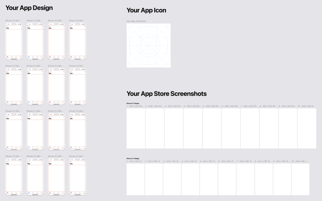
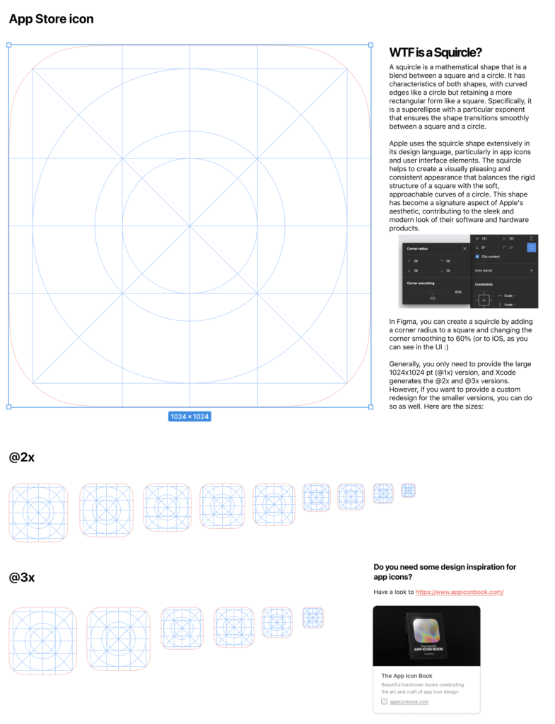
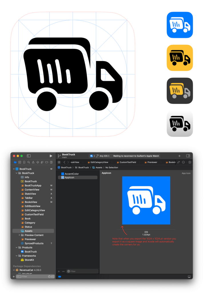
Marketing Design: Icon
Once you have finished your app design the next chapter to use Figma is for Marketing starting with the design of the app icon.
Marketing Design: App Store’s Screenshots
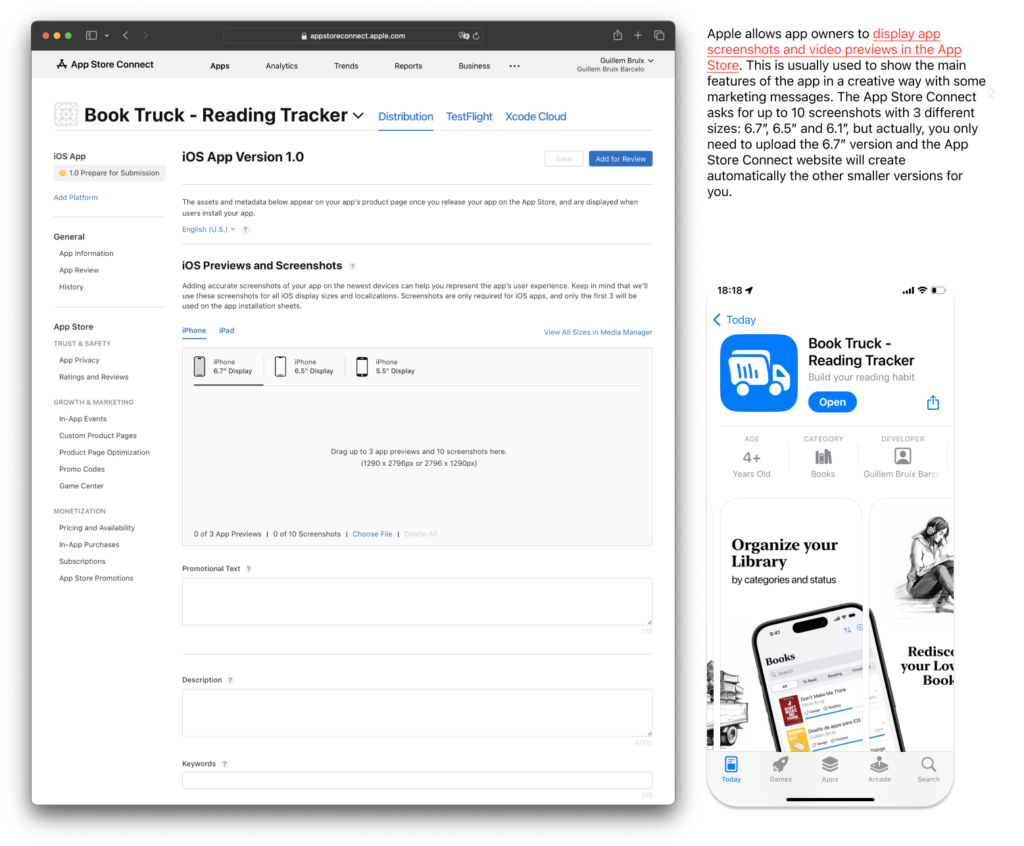
App Store screenshots are static images that showcase different features and screens of your app. They help users understand what the app looks like and what it can do. These screenshots are displayed in the app listing and are one of the first things users see when they search for an app or browse through the App Store.
Key Points:
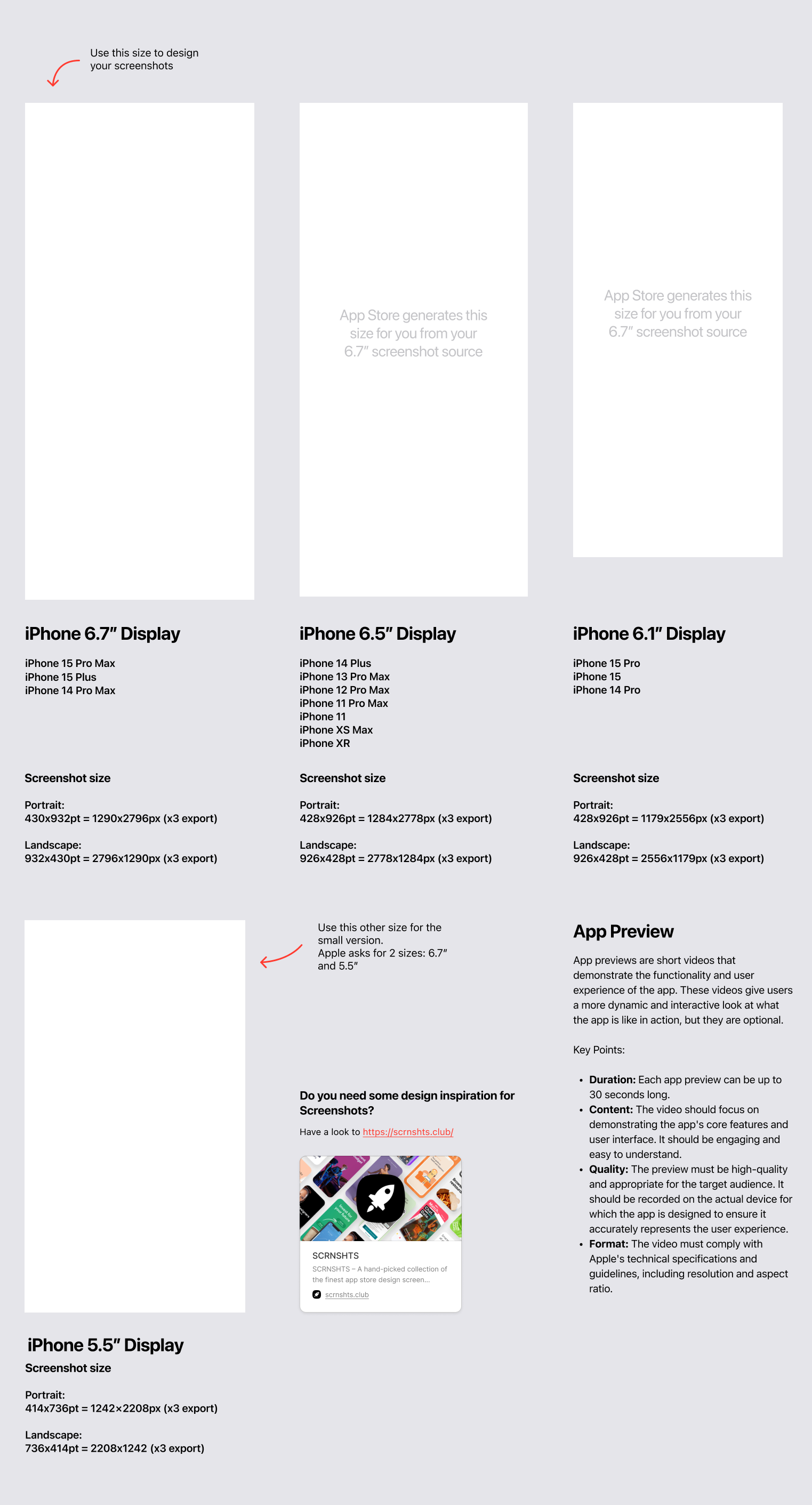
- Quantity and Order: You can upload up to 10 screenshots per device type (iPhone, iPad, etc.).
- Dimensions: You need to provide a large version (6.7”) and small one (5.5”).
- Content: They should highlight key features, the user interface, and unique selling points of the app. It’s important to make them visually appealing and informative.
Thank you for reading till the end! As I promised at the beginig you can get a free copy of The Survival Kit for iOS Design in Figma if you send this message: “S.O.S I need the Survival Kit” to the contact form of my web.