Thinking of making your own visionOS apps? I’ve spent this entire January learning how to design and program for this new platform. With the help of ChatGPT and a lot of coffee, I’ve managed to publish my first visionOS app, as of today, February 2nd. My app, Neu, is now available for download on the App Store for the first users who bought the Apple’s headset. In this article, I explain my experience making this ski app using 3D maps in augmented reality for the Apple Vision Pro. In the following lines, I share the 4 steps I followed to design and code it with some tips and recommendations with a particular focus on the UX Design. Also, you will find a free asset to download that could light the path for your own Spatial Computing app development journey!
New platform, new opportunities
Since Apple introduced the Vision Pro in the WWDC in June 2023. I’ve been obsessed thinking about the opportunities this new platform will bring us. Seems like the next logical step in the computing evolution. First, computers were workstations on our desks, where the apps were floating in 2D inside the screen. Next, apps were embedded on the small screens of our mobile devices that could conveniently fit in our pockets, and now the apps can be in 3D floating in our real room at home, office or wherever we are.
While it’s true that the VR/AR headset is not something that Apple has invented, other companies have explored this technology for years. The question remains: Is Apple going to do it again? Can Apple do the same to the current AR/VR industry as it did with the iPhone to the mobile phone industry? Or will it be a bluff, similar to Meta’s Metaverse. I don’t know. 2023 has been the year of AI with ChatGPT, Midjourney, Gemini… and the tech world doesn’t seem so excited about the Apple Spatial Computing of the Vision Pro. It is true that a few lucky tech journalists and influencers who had the opportunity to try the Apple’s headset are saying that the quality is impressive. But, what will be the response of the people once it is in the market? Will it be worth paying the expensive price? We don’t know it, but as a UX designer and indie developer, it’s exciting for me to start creating in this new world where everything is to be done, but everything is possible! I was too young in 2008 when Apple released the App Store to have the knowledge to develop apps for the iPhone. Simple indie apps like iBeer or Virtual Lighter became so popular due to their novelty and ability to showcase the interactive capabilities of the iPhone. While not necessarily groundbreaking in terms of functionality, they captured the playful and creative spirit of early app development on the platform. It feels that today we have similar opportunities with the new App Store for visionOS as indie developers had in 2008 with the iPhone’s App Store. Also, Instagram, Whatsapp, Uber, Twitter, Glovo, N26 none of these apps with huge business behind exist before the iPhone. Enough reasons for me to start developing for visionOS.
The challenge
It’s January 2024 at the moment I’m starting to write this. Apple has just announced the US release of the Vision Pro for February 2nd. I’ve set a personal goal to release my app in February, making it available for the initial Vision Pro users. However, the real challenge here is to develop a Vision Pro app without actually having a Vision Pro. Being among the first to release spatial computing apps is tricky because there isn’t much documentation available yet. Nevertheless, being a trailblazer is always exciting! Let’s start this journey together!

1. App idea
My initial thought when I saw the presentation of the Apple Vision Pro was: it looks like a ski goggles. Then, I started to imagine myself skiing with this augmented goggles that apart from protecting my eyes from the cold wind and the sunlight, it will provide me some useful information. Like the ski resort map, my current speed, and maybe some 3D fake obstacles to avoid like in a video game… I didn’t imagine myself wearing the headset when I’m commuting in the bus or walking on the street with friends or family. Sports and activities in the nature have always been my interest, so it seems to be a good fit for me. Now, that it’s the ski season, it could be an excellent excuse to go to ski more often, and I would be able to say: “I have to go to ski, because of work!” I love this idea! I’ve already had the topic of my app idea, but the scope of the idea will be defined as a result of the UX Design process.
2. UX Design
Making apps that users loves means spending the time in designing the User Experience (UX). A user-centric development approach starts to understand who are the users. Some of the people who can afford the initial price of the Apple Vision Pro, probably are the same ones who go to ski regularly, so it seems like a good audience to start researching for, but who are they? What it is important for these folks? Why will they use a Vision Pro app instead of an iPhone app or a website to find what they are looking for? Which are their problems or pain points? And how can I make a better experience for them? All this questions is what I tried to answer in my user research that I did in a whiteboard using FigJam. I followed a design thinking approach based on the Double Diamond methodology that I adapted to fit my VisionOS needs. Before jumping to Xcode to start coding, we need to have a clear understanding what features do we want to build and which ones we want to discard or build later. That’s why I personally like the Double Diamond because it is simple and helps me to choose and discard features for my MVP. Here is the link to download the FigJam file if you want to use it for your projects as well.
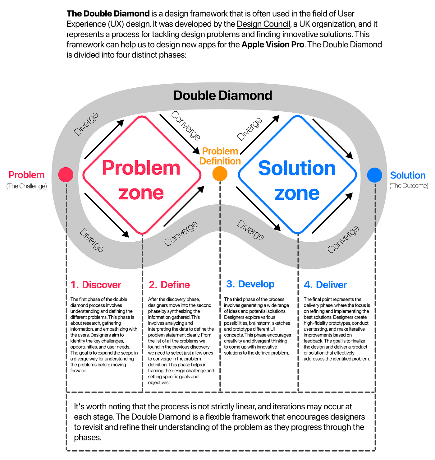
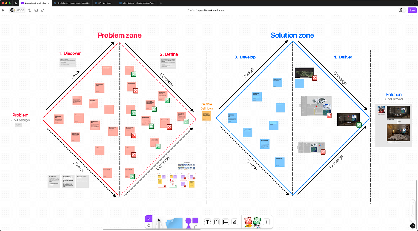
Download the FREE Double Diamond Figma file
2.1. Discover
I asked people I know who belong to this user group (including myself) to help me fill the ‘Discover’ section of this whiteboard with accurate information. A good thing to be an indie developer or building your personal projects is that you have the freedom to decide the topics that you want to work or the problems that you want to solve. So, you can scratch your own itch! At the same time, it has the disadvantage that it’s easy to avoid what is difficult for you, but useful for the user. I tried to limit the app in a reasonable scope and adapted in a possible business model that can scale later on. Earning money from this app isn’t my primary focus right now (especially not in the MVP stage), but I like to start thinking about ways to monetize it if it gains significant traction in the future.
2.2. Define
From all the problems that I found in my discovery phase, I had to converge and select the one that I prioritize, or it makes more sense to start working on. The main problem (or the ‘problem definition’ using the Double Diamond terms) that I decided I want to fix for my MVP is: Finding the right ski resort for your next ski or snowboarding trip. Organizing a ski trip, whether for a weekend or a winter vacation, can be a nightmare when trying to find the perfect resort. My app aims to provide a delightful experience by answering the following questions:
- Which ski resorts are nearest to me? I’m based in Barcelona, so I decided to focus on the Catalan Pyrenees resorts first for the MVP. Later, I can expand to include more countries.
- Which ski resorts are suitable for me or my group? Am I traveling with family, kids, my partner, beginner skier friends, or sporty colleagues? Do I prefer challenging black slopes, or are a few beginner-friendly green slopes sufficient?
- What will the weather be like? Will it snow in the previous days to my trip and be sunny on the day I go, or will it rain throughout and spoil the snow and my plans?
- How much will it cost?
- How far is it from Barcelona or my home location?
- Why am I using an Apple Vision Pro for this instead of typical ski websites?
I decided to stop the scope here for the MVP. Since we are in the Define phase, we need to choose, so the problems or questions that I decided to discard for know are:
- Where I will sleep or eat? Hospitality.
- What are the current snow conditions? Snow live condition data.
- How many slopes and lift are open? Resort live data.
- What slopes I want to ski, and how fast I am? Ski tracking capabilities.
- …
Why I decided to fix these problems and discard the other ones? Well, in my case, I wanted to keep it simple for the MVP and focus on the 3D objects like the augmented reality resort maps that can be so handy for an AR Headset. Also, my personal skills and preferences. I wanted this app to be UX focus instead of data focus. I’m better in design than dealing with external APIs, and I don’t want to pay for live data, neither. So, I decided to focus on the trip discovery and discard the data tracking and live snow data focus.
2.3. Develop (UI Design)
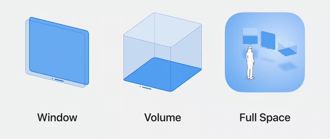
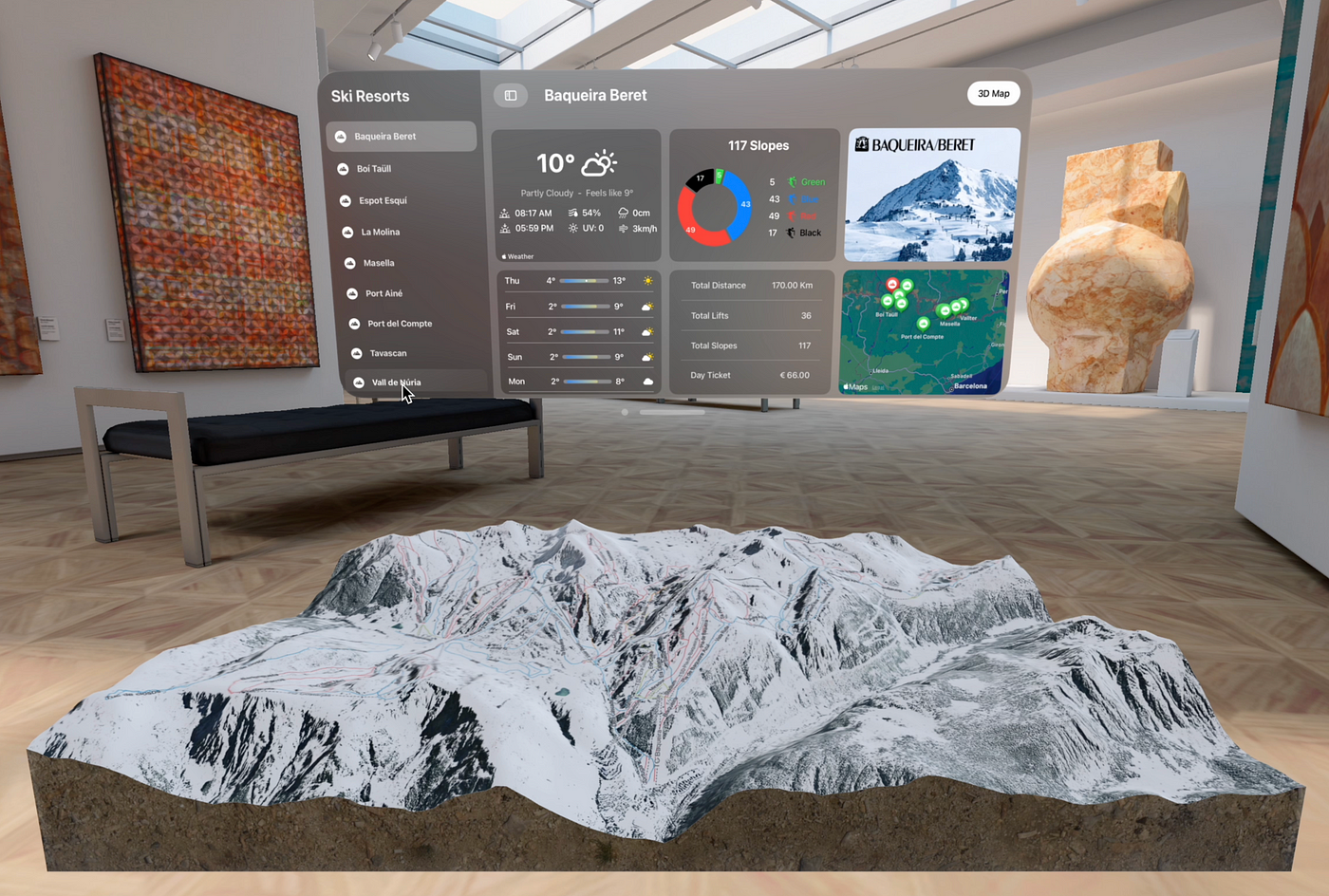
In the context of UX, we are referring to develop stage to start designing the UI. The main difference of a visionOS app than a mobile app or a website is the 3D elements in an immersion virtual space or an augmented reality one. Other differences are: the interaction design (gestures and eyes tracking) and the spatial audio. VisionOS apps have 3 types of content: 2D windows floating in the 3D space, volumes or 3D objects and full space taht is where different windows and volumes can coeexist. According to what is better for the type of information that we want to show. For instance, all the ski resorts navigation and data makes sense to display in a 2D floating window in a shape of a dashboard similar to an iPad app, but using the new frosted glass materials and UI elements. The resort map with all the slopes is perfect to display as a 3d object to appreciate the relief of the mountainous terrain.
2.4. Deliver (UI Design)
For the 2D windows, I will follow Apple’s recommendation. After watching the Principles of spatial design and Design for spatial user interfaces WWDC videos, I’ve downloaded Apple’s Figma templates for VisionOS and I started to try different possible UI designs in Figma that answer the questions of the Define phase.
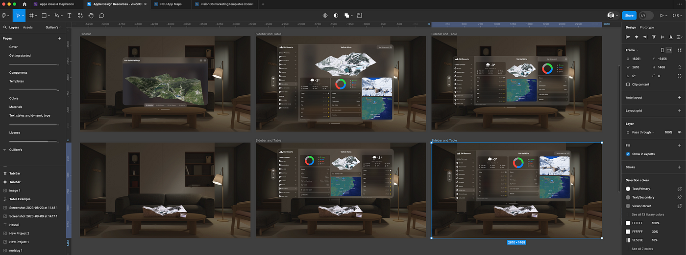
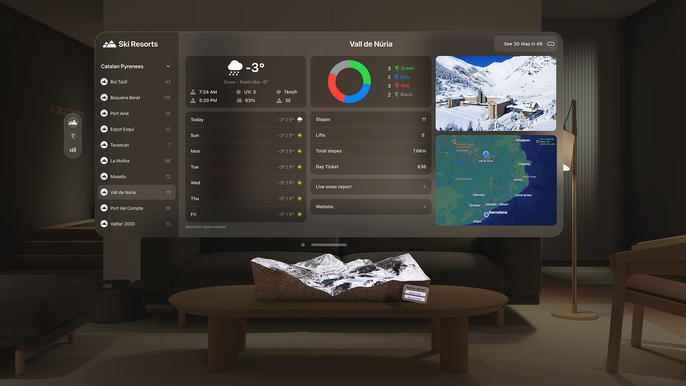
3. 3D Design
VisionOS offers two modes for app development: passthrough and immersive. Passthrough mode involves using the Apple Vision Pro headset’s external cameras to view the real world. In this mode, applications and windows appear as if they are suspended in mid-air. Users can interact with the interface using gestures and eye movements. Conversely, immersive mode transports the user into a fully 3D virtual environment. This mode submerges the user in a digitally created scene populated with 3D objects. Apps in immersive mode can include games where the user becomes part of the game’s virtual space. Basically, what all other brands call AR for Apple is passthrough mode and VR is Immersive mode.
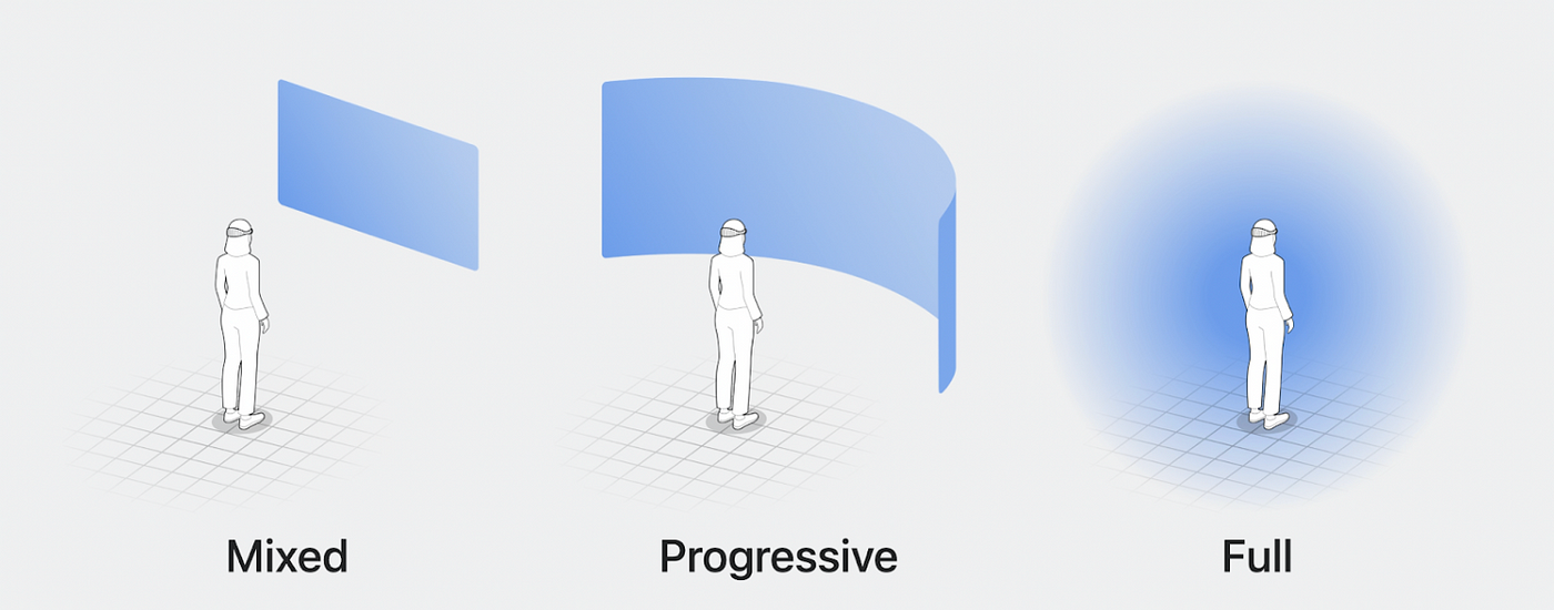
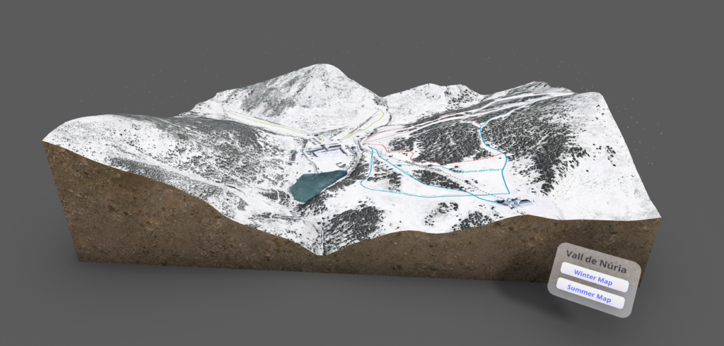
For my Neu app, I needed to create 10 3D maps of the 10 Ski resorts of the Catalan Pyrenees with all the slopes and lifts represented as well as the mountain elevation. This has been a very manual process where I first needed to find the right open source map data and later craft it all together in Blender and export to the right format for Xcode. I’m not used to work with maps, but it was kind of fun to learn all these tools:
- OpenTopography to get the data for the 3D elevation mesh of each resort.
- IGN (Instituto geográfico Nacional) to get the aerial photos that later I manually edited in Photopea to convert to this black and white look to simulate a snowy landscape.
- OpenSkiMap to get the slopes and lift vectors for all the ski resorts.
- Figma to mix the IGN’s photos with the OpenSkiMap’s vectors.
- Spline to easily prototype my 3D object.
- Blender to put everything together in one 3D object and export it to GLB format.
- Finally, I used Apple’s Reality Converter to export the GLB to USDz for importing in Reality Composer Pro and Xcode.
Check a 3D Map online in Spline
After doing this process 10 times, here are some 3D creation recommendation that can help you in your 3D asset creation process:
- Keep it as simple as possible: Few meshes and few materials per object. Avoid complex hierarchy with multiple group inside groups.
- Be careful with the measurements: Try to keep the objects between 1 or 2 meters in Blender or in your 3D software. So many times happened to me to not be able to see the object due to the enormous sizes in Reality Composer Pro.
- Create your objects in your 3D software: export them using .GLB extension and convert them into USDz in Reality Converter app. Don’t export USD from Blender and directly open them in Reality Composer Pro. It didn’t work very well for me.
- Re-create your materials in Reality Composer Pro: Probably, you will need to import your texture images in Reality Composer Pro too. For some reason, the ones that come with the USDz from Reality Converter have warnings and issues.
4. Coding
Now that we have a clear UI Design as a result of our UX exploration and the 3D assets ready, we can start thinking about how we cook all of this in Xcode. Programming for visionOS in this early stage have two positive things and a negative one. First, we can use the same languages that we use to code iPhone apps (Swift and SwiftUI), the same IDE (Xcode) and the same distribution platform (App Store) this is a huuuge competitive advantge respect Apple’s competior like the Meta Quest. Second, since it is the first version of visionOS we don’t need to care about compatibility with old visionOS versions. However, the bad thing is that we don’t have a lot of documentation available, only the Apple’s one. Luckyly for all of us, this will start changing soon, but for now, we have to watch the Apple’s WWDC23 videos related to SwiftUI and Reality Kit for visionOS. My recomendation here is to follow this order:
- Develop your first immersive app — WWDC23 — Video
- Meet SwiftUI for spatial computing — WWDC23 — Video
- Elevate your windowed app for spatial computing — WWDC23 — Video
- Build spatial experiences with RealityKit — WWDC23 — Video
- Take SwiftUI to the next dimension — WWDC23 — Video
- Go beyond the window with SwiftUI — WWDC23 — Video
- Meet Reality Composer Pro — WWDC23 — Video
- Enhance your spatial computing app with RealityKit — WWDC23 — Video
- Evolve your ARKit app for spatial experiences — WWDC23 — Video
- Explore materials in Reality Composer Pro — WWDC23 — Video
- Work with Reality Composer Pro content in Xcode — WWDC23 — Video
- Meet ARKit for spatial computing — WWDC23 — Video
For the coding of the Neu app, I decided to utilize SwiftData along with the new observation framework powered by Swift macros to persist resort data. I employed the standard NavigationSplitView for the sidebar menu. All weather data are sourced from Apple’s WeatherKit. Apple Maps was used for the 2D map (the one inside the 2D window). Lastly, SwiftCharts was used for the sector mark chart, also known as a donut chart, which I used to represent the different numbers associated with the slopes’ colors. Each 3D map was added as an immersive space. Something I want to change for the next version is to add them as independent 3D volumes using ARKit, allowing them to coexist simultaneously.


One thought on “Developing my first visionOS app: 4 steps I followed”