Loved or hated, Apple introduced new ways to customize the Home Screen of iOS 18 at WWDC 2024. Users can now arrange apps and widgets in any open space on the Home Screen, including placing them right above the dock for easy access or perfectly framing a wallpaper. App icons and widgets can take on a new look with a dark or tinted effect, and users can make them appear larger to create the experience that is perfect for them.
Personally, as a dark mode user, I think dark icons on the home screen are a great idea. I also missed the ability to arrange the icons wherever I wanted on the home screen. Larger icons without the text of the name are a nice feature too. However, I’m not so sure about the new tinted icons.
Tinted Icons Pros
- Give the freedom to personalize the icons to match the style of the wallpaper or to choose the user’s favorite color. When users customize their objects, they establish a new emotional connection with their device because their phones become the “user’s creation”. They love their iPhones because they “designed” them, making each phone one of a kind. This is why some car or sneaker brands offer so many color customizations options.
Tinted Icons Cons
- Not all users are good with aesthetics. Let’s be honest, they will destroy the delightful look and feel of the icons designed by professionals.
- Different colors are important for findability. If you are looking for the LinkedIn icon, your brain will start scanning for blue icons; if you want to open Spotify, your eyes will go for the green ones. If all icons have the same color, finding the app you need becomes more complicated.
What does this mean for app designers and developers?
Xcode 16 now requires three icon versions. Let’s see how we can design them by following the Apple Human Interface Guidelines and using Figma as a design tool. You can also use my Figma file to design and export your icons.
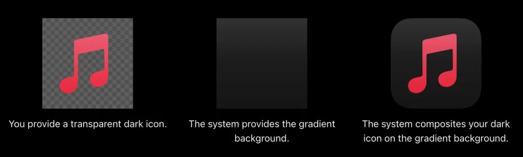
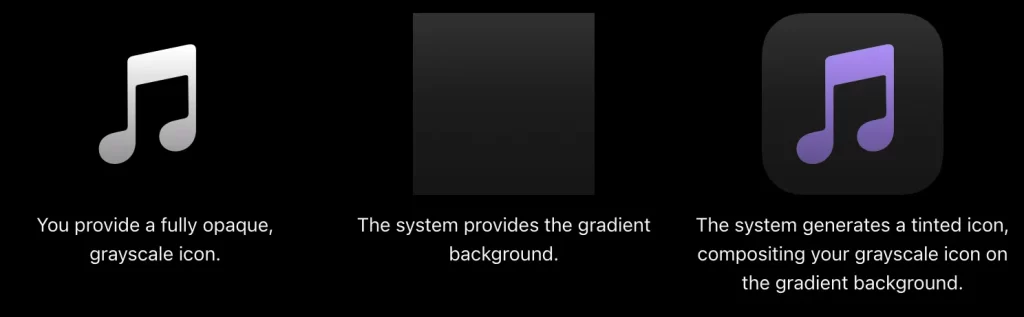
My guess is that Apple automatically generates the dark and tinted icons for all published apps. They might use the same light icon for the dark version. For the tinted version, they might convert the icon to a grayscale image, apply a “multiply” blend mode, and add a background layer with the color selected by the user. However, if you plan to update or submit a new app for iOS 18, App Store Connect will require you, as a developer, to provide the tinted and dark versions of your app icon.
Apple design team has changed all Apple apps to provide a dark and tinted versions:
They follow a couple of basic rules that they ask all developers and designers to follow as well when creating their icon versions:
- Keep the same dark gradient from top (#313131) to bottom (#141414) for the dark and tinted versions. You can copy the icon template with this gradient from my Figma file.
- Export your icon image at 1024×1024 px with a transparent background for the dark image and a grayscale with a black (#000000) background for the tinted image.
How can I design my app icon versions?
Use the below grid to add your icon in the proper spot inside the squircle respecting the margins.
Optionally, if you consider a customized icon for the small version is needed, you can design the @2x and @3x versions as well. Otherwise, the App Store system will auto-generate these from the 1024×1024 px version.
You can use my Figma file, which I used to design the icons for my Book Truck app to design the icons of your app. Refer to the official Apple documentation on the Apple Human Interface Guidelines and find some design inspiration on https://www.iosicongallery.com/ or https://www.appiconbook.com/.